본문 바로가기
안드로이드/Jetpack Compose

[안드로이드 Compose] Button

by 안드뽀개기 2022. 4. 24.
반응형

이번엔 버튼 속성에 대해 알아보겠습니다.


@Composable
fun ButtonContainer(){
Button(
elevation = ButtonDefaults.elevation(
defaultElevation = 0.dp
),
enabled = true,
onClick = {
Log.d("TAG", "Button 1이 클릭 되었다.")
}
) {
Text(text = "Button 1")
}
}
view raw Button1.kt hosted with ❤ by GitHub


버튼 1

elevation : 버튼이 z축으로 올라와 보이는 효과
- defaultElevation :  elevation의 기본값


@Composable
fun ButtonContainer(){
Button(
elevation = ButtonDefaults.elevation(
defaultElevation = 10.dp,
pressedElevation = 0.dp,
disabledElevation = 0.dp
),
enabled = true,
onClick = {
Log.d("TAG", "Button 2가 클릭 되었다.")
}) {
Text(text = "Button 2")
}
}
view raw Button2.kt hosted with ❤ by GitHub


버튼2

elevation : 버튼이 z축으로 올라와 보이는 효과
- defaultElevation :  elevation의 기본값

- pressedElevation : 버튼이 눌렸을 때 elevation 값,

- disabledElevation : 버튼의 enabled가 false일 때의 elevation 값


@Composable
fun ButtonContainer(){
Button(
elevation = ButtonDefaults.elevation(
defaultElevation = 10.dp,
pressedElevation = 0.dp,
disabledElevation = 0.dp
),
enabled = true,
shape = CircleShape,
border = BorderStroke(4.dp, Color.Yellow),
onClick = {
Log.d("TAG","Button 3가 클릭 되었다.")
}) {
Text(text = "Button 3")
}
}
view raw Button3.kt hosted with ❤ by GitHub


버튼3

shape : 버튼의 모양

 - CircleShape

 - RectangleShape

 - RoundedCornerShape(dp)

border : 테두리의 색, 두께 지정


@Composable
fun ButtonContainer(){
val buttonBorderGradient = Brush.horizontalGradient(listOf(Color.Yellow, Color.Red))
// remember{ } : 변경이 발생하면 뷰를 다시 그린다.
val interactionSource = remember { MutableInteractionSource() }
val isPressed by interactionSource.collectIsPressedAsState()
val pressStatusTitle = if(isPressed) "버튼을 누르고 있다" else "버튼에서 손을 뗐다."
Button(
elevation = ButtonDefaults.elevation(
defaultElevation = 10.dp,
pressedElevation = 0.dp,
disabledElevation = 0.dp
),
enabled = true,
shape = RoundedCornerShape(10.dp),
border = BorderStroke(4.dp, buttonBorderGradient),
colors = ButtonDefaults.buttonColors(
backgroundColor = Color.Black,
disabledBackgroundColor = Color.LightGray
),
interactionSource = interactionSource,
onClick = {
Log.d("TAG","Button 4가 클릭 되었다.")
}) {
Text(text = "Button 4", color = Color.White)
}
Text(text = pressStatusTitle)
}
view raw Button4.kt hosted with ❤ by GitHub

버튼4

border : 테두리의 색, 두께 지정

 - 테두리의 색을 그라데이션으로 줄 수 있다.

colors : 버튼 색상을 설정

 - backgroundColor : 기본 배경색 설정

 - disabledBackgroundColor : enable이 false일 때의 배경색 설정

interactionSource : 사용자의 interaction에 대한 설정

 - remeber { } 를 이용하여 사용자의 interaction이 변경되었을 때, UI를 다시 그린다

 - interactionSoucre.collectionIsPressedAsState()를 통해 사용자가 버튼을 눌렀을 때 isPressed 변수에는 true값이 저장, 버튼을 뗐을 때에는 false값이 저장된다
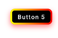

@Composable
fun ButtonContainer(){
val buttonBorderGradient = Brush.horizontalGradient(listOf(Color.Yellow, Color.Red))
val interactionSourceForSecondButton = remember { MutableInteractionSource() }
val isPressedForSecondButton by interactionSourceForSecondButton.collectIsPressedAsState()
val shadowRadius = if (isPressedForSecondButton) 0.dp else 10.dp
// 버튼 클릭되었을때 그림자의 애니메이션 효과 적용
val shadowRadiusWithAnim: Dp by animateDpAsState(targetValue = shadowRadius)
Button(
elevation = ButtonDefaults.elevation(
defaultElevation = 0.dp,
pressedElevation = 0.dp,
disabledElevation = 0.dp
),
enabled = true,
shape = RoundedCornerShape(10.dp),
border = BorderStroke(4.dp, buttonBorderGradient),
colors = ButtonDefaults.buttonColors(
backgroundColor = Color.Black,
disabledBackgroundColor = Color.LightGray
),
interactionSource = interactionSourceForSecondButton,
modifier = Modifier.drawColoredShadow(
color = Color.Red,
alpha = 0.5f,
borderRadius = 10.dp,
shadowRadius = shadowRadiusWithAnim,
offsetX = 0.dp,
offsetY = 5.dp
),
onClick = {
Log.d("TAG","Button 5가 클릭 되었다.")
}) {
Text(text = "Button 5", color = Color.White)
}
}
view raw Button5.kt hosted with ❤ by GitHub

버튼5

버튼 4에서 그림자를 추가한 버튼입니다.

modifier : 뷰의 높이, 너비, padding, 등 다양한 설정 가능

여기서는 Modifier의 extension 함수를 만들어 커스텀 그림자를 적용
커스텀 그림자의 소스는 하단에 링크 참조
https://smashandroid.tistory.com/88


shadowRadius : 버튼이 눌렸을 때 그림자가 사라지고, 버튼을 뗐을 때 버튼이 나타나도록 설정하기 위한 변수

shadowRadusWithAnim : 그림자가 사라지거나 나타날때의 애니메이션을 적용하기 위한 변수

반응형